I don't have some personal tale of woe, nor have seen gambling addiction up close amongst anyone I know. Once upon a time, I had a random experience that taught me a lot about gambling.
It happened in Reno, or maybe Sparks actually. The usual random freeway motel had the usual small Nevada "casino" attached, and after the usual way, way too adjective-less run from Salt Lake City to Reno, it seemed like a nice way to unwind for a while. In advance, I decided to strictly budget just 20 bucks towards boredom busting. I was on the way to the City by the Bay, and friends and fun were waiting for me there.
Delighted by the dirt cheap beer obtained therein, I decided to stretch my time budget by playing the nickel machines. I do like the video poker, on the perhaps dubious thought that by picking the cards to discard, I was more involved in the process of losing my money than the zombies at the regular slot machines. Somewhere during the very bored doldrums of losing my last dollar, I got a Hit. I found a baseball card in there? No, silly, a "jackpot". Hmm, I think I will say that loudly the next time I'm ripping packs and I get some B-list "game used Relic" card no one wants. Maybe Saturday, when I get to visit a new FLCS that I hope has some Series 2 for me to rip. I hope the owner doesn't get mad at me.
What was it? How much did I win??? It was a Royal Flush on that video poker machine. I won 20 bucks!
Exciting, eh? My partner in crime suggested moving on up, but I celebrated by quitting on top, even on the evening, dollar-wise, and even a little ahead of the joint, since I had four beers worth of buzz going on, and my 20 bucks.
I can't remember the odds of pulling a Royal Flush, but the payout was around 400:1, give or take a little. (This was over 20 years ago now). But the whole experience was very deflating actually, and it has stayed with me ever since. This is because I instantly realized that if I had been playing the quarter machine, I would have won a Benjamin Franklin, and if I had been playing the dollar machine, like my buddy was, that would have been four Benjamins. Real Money.
And I've hardly gambled ever since. Risk just a little, win just a little. Risk a lot, lose a lot. Now when I once-in-a-while check out some old fart band at the backwoods casino round here, I avoid all the gaming machines and 'the pit'. Instead, I gamble at the bar. The backwoods are just full of cougars you know.
I have been thinking about this since Saturday, when I got to thinking Fortuna was really smiling on me, and perhaps I should have bought Lottery tickets that day. On that day I decided to try out some of this year's Archives. First, I hit up a Wal-Mart, probably the closest one to my hometown (yep, 23 miles away), since I wanted one last blaster of blues, and some binder pages. I didn't think the other box store down the way had binder pages. But Wally was sold out of binder pages and blasters, though he did have the new Archives. I'm seriously in need of some more binder pages as the stacks and cardboard boxes on my new card table are getting out of hand. So off I went to the other box store, the one you've never heard of most likely (Meijer's). Their binder pages were junk, but they had Archives too. Don't mind if do, blaster number two.
So, so, so, are we gonna see some cards finally? Sooooo much text, nooooo cards. Nope, we'll go with the wrapper first. I love this wrapper, plus it has foreshadowing:

I mean, that anonymous Montreal Expo there is gonna blast one, right?
But the wrapper also has my first OCD complaint. No, I don't have OCD. My card stacks are a mess. (I do use lots and lots of penny sleeves though, your trade bait stays in nice shape on my card desk.) But learning where this wonderful wrapper came from makes one jones for a 21st century version of Topps Super. Would have made perfect box-toppers. But then the extra-thick cardboard would make this 2013 extra-thin cardboard seem that much thinner, now wouldn't it. What is Topps Super? Check out this excellent blog for all things Topps, if you've never seen it. I could (and do) get lost in there for hours. And last year we had the so-hard-to-pull-I-never-pulled-one '82 In Action subset, not this year when we have '82 style cards.
So, yeah, Archives is another frustrating Topps product. But, I've always liked 1972 cards, and it will be a long time, if ever, before I chase a set of 1972. Sure, it would be great fun, but I doubt it will ever rise to the topp of the to-do list. So I made my peace with what I don't like — since these will just be going into binder pages to enjoy visually, I'm sorta OK with the terrible card-stock. My Heritage cards, I like to paw through the stacks. A totally different experience.
And this is what I like:

Back in '72, there weren't any Babe Ruth cards. I have a soft spot for them, though I have no need to chase them, since I now know Topps will probably be showering them on me the rest of my life. I do really need that '75 style from one of the Fan Favorites set about ten years back now, however.
I also have a soft spot for Topps Pops cards. I got one way back in February in the kinda-goofy "Calling Cards" insert in Series One. I hadn't seen Pops on a cardboard in a very long time, and that started to mellow me on insert set silliness. I am pretty happy to see him again:

Can't say I've ever noticed a batting helmet put on over a regular ballcap before, though I'm sure it has happened elsewhere. Hey Willie, let's get a batting shot. Sure, let me grab a helmet. I will be watching for that odd little meme on all cards going forward. It also makes me realize that serious batting poses shouldn't go with ballcaps, but of course they do on baseball cards. See what these baseball cards do to me?
Moving on, I just love this card, another '85 style:

This card pretty much has A Lot Going On. Great Night Card of course. And helmet-on-backwards, but the mask off. The way a Catcher card should be. And we have a Patch Card - shoulder patch that is. The memorial patch for Paul Splitorff. But that means this photo is from 2011. Tsk, tsk Topps, hitting soft lazy fly balls again. But since their Spring Training shot backdrops are getting incredibly repetitive, we'll let that go. And then we have Salvador about to throw a fastball. How cool is that? Can't say I've ever seen a non-pitcher about to do that on a baseball card before. And, hey, he might even be chewing tobacco there. Pretty doubtful, but just that extra tick of old-timey baseball imagery, it's almost getting subliminal, or instinctual, or sentimental, or something.
I've been watching for Salvador Perez cards since I got his Spring Fever card earlier this year. I still need some of those, by the way. Googling around on his card oeuvre so far, it makes me wonder how he slipped into the world of Topps without the little RC deal. His is in 2011 Bowman. I never buy Bowman cards. Yes, I know that's Topps too. I like and dislike that RC thing.
I've found some other things to enjoy in my little stack of Archives so far, but I'll be merging those scans with other recent cards that are all going to live together on my esoteric themed binder pages.
Here's a good example of what I don't like:

1990. Why, Topps, Why? Sure, some of these newer ones nicely matched the card colors to the team colors. But the nice efforts just can't wash out the taste of the nonsensical ones.
I am keeping this one, but more because I like cards with Trees on them, and chain-link, and I enjoyed watching Ryu hit a triple the other night:

Dodgers and yellow? Red, Topps, Red. Duhh. Great blue glove though. I like colorful cards and the 70s and nonsense and colors and Design and things that make me dizzy....but not 1990. I give Topps credit for going for it and taking a mighty rip, like Ortiz probably just did up there, but they fell down in a heap over the plate. I mean the design has always seemed Mondrian-esque, but it is in the baseball card dictionary in my head as the example under the word FAIL. Here is the masterpiece by my second favorite Dutch painter:

And I was meandering there about Topps photo backdrops of late. Each team has one just for them it seems, at least down in Floriday. This one amuses me some:

I've always liked empty stadium shots for some reason. But I'm starting to think the Yankees play their Spring Training games in a prison. Not sure if I want to bind some of these together. They make me feel kind of bound-up. I just can't look away. Who is watching me from those windows? I didn't do it. I didn't do it! Snowden did it. I surrender!
Another mystery is this pair of cards:


Did Topps borrow these from the set of some new 3-D video baseball game stop-motion recording effort? I just can't recall such perfect matte-backdrops on cards before. Or the Belt card is the most perfect pure blue sky shot ever, but it doesn't look very outside-y. Sometimes, maybe the digital age is just too digital. Oh no, here is a terrible thought....should I only collect vintage because that old time analogue film gives card images more "warmth"? How else can I keep up with the hipsters down at the record store? Will I need special antique shoeboxes to keep the cards in, so they age just right too? What would Neil Young say? He probably has special gear for his cards.
Also in the Why, Topps, Why department are these two items:


I'm not sure I like the idea of borrowing from other sports for my baseball cards. Topps should have lots of odd old baseball products to regurgitate on us, but perhaps they are running low. I did like the cartoon on the back of the Cespedes "Tall Boy" (dang that makes me both thirsty, and wanting to reach for some Widespread CDs); haven't seen anyone post a back yet:

Don't forget you can just click on a picture embedded on a blog page to get a bigger view of it.
I will be letting go of most of the things that I got in these 2 blasters, except for the 72 cards. How much will I have to pay somebody to get rid of this one:

One neat thing about "in-the-style-of" cards is when Topps uses an original design that included facsimile autographs. I think some hand-writing expert should get to work on 21st century sports star card autographs, vs. prior decades. The decline of signatures just makes me laugh. At least Topps could hand the ball-player a decent working ink pen:
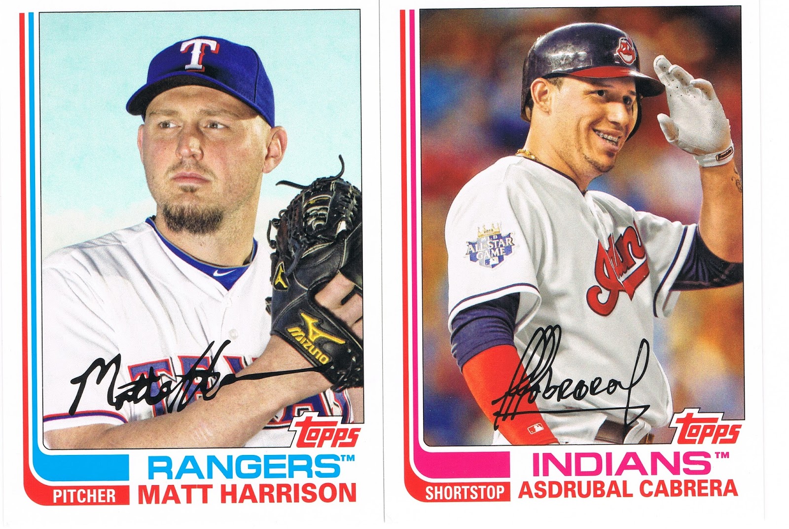
10-4 there Asdrubal, or fffobrof or whatever the heck. And Yo, Topps, I like smiling baseball players on my baseball cards, 'cept maybe that creepy Tall Boy up there; they're kinda rare outside of the Heritage set. But maybe you could be a little nicer to the Caribbean players who didn't have access to good dental care when they were young. K? Thanks. They are so nice and friendly though. Not like them 'mericuns.
Another goofy autograph is found on this card, but I like this card too:

A Cloud Card, AND a Light-Tower Card. And I just like Chapman's cards, usually. 'cept when they basically repeat his pose. Repeats repeats repeats. No, not this card, I like this card. I just had to type repeats repeats repeats in this post here somewhere repeats repeats repeats. That's probably why I like this card. Chapman's upcoming Series 2 card is pretty much a repeat of his awesome 2011 card, and that bums me out. When they're not repeating the picture (like Asdrubal's), they are repeating the pose, as Night Owl ably demo'd recently. Lazy lazy lazy. I used to set aside repeat card images so I could cleverly put them all together and bitch about them, but there are just too too too many.
Anyway, I like this 82 Chapman effort. You'll see it again, along with a bunch of others from 2013 Archives when I amalgamate them with other cards with Clouds, or Light-Towers.
What you probably won't see again, are very many of this type of card:

Fan-Favorite Autograph, I should have had to purchase about 8 blasters to find one of these. Autographs just don't do much for me. Eventually I'll put up a long roll of the ones I have for Trade Bait. Watch this space tomorrow for a big post on my big new project, that won't involve autographs, but will involve giving up all my autographs to complete. And it will involve the Base Set of course.
Anyhow, I have always thought I would like just one autograph card to keep. Preferably an on-card autograph. Of a Detroit Tiger. And whaddyaknow:

Boom! Maybe they don't call 'em blasters for nuddin'. 2 Blasters, 2 FFA- cards. The Odds? Dang, if only I had gone to a Friendly Local Card Shop instead, I could have picked up a Hobby Case instead. There is that '75 Pele auto to Chase. Hey, I'm going to an FLCS on Saturday....
Very nice pulls there. I'd wish you good luck on the next pack, but it look like you don't need it.
ReplyDeleteGreat pulls! But of course I NEEEED that night card and the Ryu card!
ReplyDeleteAnd the artist you're looking for regarding the 1990 set is Lichtenstein:
http://nightowlcards.blogspot.com/2009/05/define-design-poll-is-up.html
I really wish we all had a grown-up forum somewhere we could use sometimes.
ReplyDeleteI probably won't buy too much more Archives. Maybe a little bit of Hobby action tomorrow to get more bait for my wants/needs/desires. If I come across an extra Ryu or Perez I'll set one aside.
re: 90 - yeah, Lichtenstein is a great call, but just for the slowly dissolving dots. I've never known what to make of Lichtenstein, vs. Warhol in terms of being contemporary with each other; i.e. who came first. I've always looked forward to exploring that but one-of-these-days. The framing of 1990 has always said Mondrian to me. I will think of it as Mondrian meets Lichtenstein now though.
If you like Lichtenstein, check out the work of Niagra, a Detroit artist who is in a permanent homage mode with him. She created one of my favorite expressions: "tomorrow is another night".
I actually like the 1990 _design_ a lot in terms of the framing. They just executed it very poorly on the more-is-better route to failure, i.e. just simply too many colors. Ortiz there only needs a bit of orange in there somehow to make a Roy G. Biv card (ROYGBIV - you can look it up). Does anyone want a complete ROYGBIV card? Oh dear, I'm typing about 1990 again. I need to save this stuff for another long blog post that is stuck in my head. Maybe these Archives versions will start to grow on me. I hope not.